
A collection of design projects exploring branding, packaging, illustration, editorial, digital, and promotional design across a range of creative challenges.
Each project reflects a different opportunity to explore visual communication, combining thoughtful concepts, purposeful design decisions, and adaptable creative solutions across both print and digital applications.
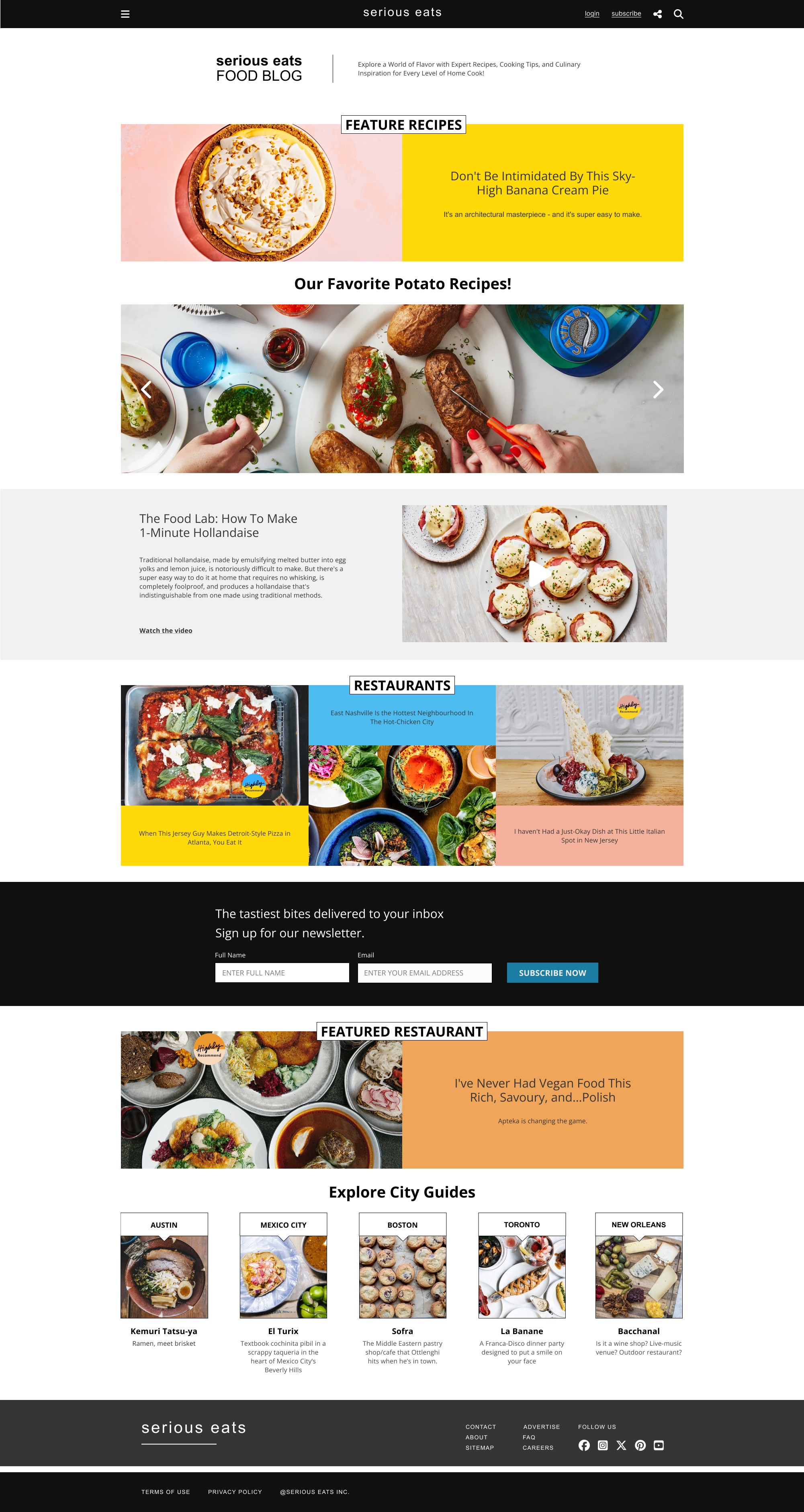
Serious Eats was redesigned as a responsive homepage experience that adapts across desktop, tablet, and mobile devices. The project focused on maintaining the established character of the food-focused platform while reorganizing its content into a clear and engaging interface that remains consistent across different screen sizes.
Layout, navigation, and content hierarchy were adjusted for each breakpoint to support readability and usability without losing visual continuity between devices. The resulting system demonstrates how the same content and identity can respond to changing screen dimensions while maintaining a cohesive user experience.



Anchor is a mobile application concept designed to support individuals living with chronic pain and the mental health challenges that can accompany it. The app brings education, community, and accessible support resources together within a single platform, creating a space where users can find information while connecting with others who understand similar experiences.
The interface was designed around clarity, accessibility, and ease of navigation, using a calm visual system to organize potentially overwhelming information into manageable and approachable sections. Community features and educational resources work together to create an experience focused on connection and support while maintaining a straightforward, intuitive user journey throughout the application.
Butter Bakery & Cafe combines brand identity and web design to create a warm, inviting digital presence that reflects the personality of the business. The project included the development of a custom logo and desktop homepage designed to showcase the bakery, its products, and key services through a cohesive, approachable, and visually engaging experience.
The website uses intuitive navigation, clear content hierarchy, and inviting food imagery to guide visitors through the available offerings and business information. Consistent typography, colour, and branding carry the identity throughout the page, creating an experience that feels welcoming while keeping important content easy to find and explore.


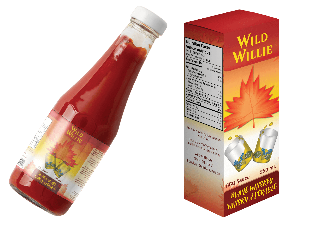

Wild Willie BBQ Sauce is a packaging project developed around a maple whisky flavour, combining custom illustration and bold typography to create a distinctive handcrafted personality. The visual direction uses warm colour and seasonal imagery to communicate the flavour profile while giving the product a strong and recognizable presence.
The design extends across both the bottle label and retail box, creating a cohesive packaging system that carries the same visual language between formats. Illustration, typography, and supporting graphics work together to maintain consistency while allowing each piece of packaging to function effectively within its individual structure.
Littlest Pet Shop is a collectible packaging project centred around an original chameleon character and illustrated environment. The design was developed to bring the character's playful personality to life while creating an engaging package that feels consistent with the colourful, character-driven world of the existing brand.
The character, environment, and supporting graphics were illustrated specifically for the project before being incorporated into a custom blister package. Bright colour, playful proportions, and layered environmental details transform the packaging into part of the character's world while keeping the collectible itself clearly visible as the focal point.


Trace Magazine is a 12-page editorial publication exploring the relationship between thought, form, and the creative tools that shape artistic expression. The project combines articles, supporting imagery, advertisements, and editorial content within a cohesive visual identity designed to carry consistently throughout the publication.
Typography, imagery, and structured layouts work together to establish hierarchy while allowing each article and spread to maintain its own visual character. The resulting publication balances consistency with variation, creating a connected reading experience from the cover through to the final spread.
Fahrenheit 451 is a concept-driven book cover redesign that uses typography as the primary visual element throughout the composition. Rather than relying on traditional illustration, the design transforms letterforms into imagery, creating a distinctive visual interpretation of the novel while maintaining a strong connection to its themes and literary identity.
The central open-book graphic was constructed entirely from the letters in “Fahrenheit,” allowing typography to function as both language and illustration. Warm gradients and layered typographic details reinforce the themes of fire and literature, carrying the concept across the front cover, spine, and back cover as a complete publication design.


Atari: Frogger is a promotional poster that combines two recognizable pieces of gaming history into a single vector-based composition. The project reimagines the classic Frogger experience through the physical form of an Atari console, creating a nostalgic visual that connects the game directly to the hardware associated with its era.
The console, controller, game elements, and supporting details were constructed as vector artwork, with the Frogger environment integrated throughout the composition. Perspective, colour, and layered game imagery transform the hardware into part of the gameplay itself, creating a playful promotional piece built around visual storytelling and nostalgia.
Lux Fracture is a concept movie poster created entirely through photobashing, combining existing photographic assets to construct an original fantasy environment. The project focused on transforming unrelated source imagery into a believable cinematic scene through composition, atmosphere, lighting, and seamless visual integration.
Individual elements were composited, colour graded, and reshaped through painted highlights and shadows to establish consistent lighting across the final environment. Careful blending allows the separate photographic sources to function as a single scene, creating an immersive fantasy setting without the use of custom illustration.


Aethyri is an original superhero poster developed through photobashing and digital compositing techniques. The project combines photographic elements, effects, and environmental imagery to create an original character within a dramatic promotional composition that establishes both her visual identity and the atmosphere surrounding her story.
Lighting, colour grading, typography, and environmental effects work together to unify the individual elements and create depth throughout the composition. Careful blending and image manipulation transform the separate photographic sources into a cohesive cinematic poster focused on character-driven storytelling and entertainment-focused promotional design.