
A complete brand identity developed for Coolie Co., combining custom logo design, apparel graphics, and promotional materials into a cohesive motocross-inspired visual system.
Built around the energy and attitude of motocross culture, the identity creates a bold and recognizable presence designed to connect with riders while remaining flexible across apparel and branded applications.

MOTOCROSS APPAREL & BRANDING
Coolie Co. is a motocross-inspired apparel brand developed to capture the energy, movement, and attitude associated with the sport. The identity combines a custom logo, bold typography, and graphic elements influenced by motocross culture to create a recognizable visual presence that feels at home within the riding community.
The project extends the identity across a coordinated apparel collection and supporting branded applications, demonstrating how the visual system can adapt across different products while remaining consistent. Each piece was designed to feel connected to the larger Coolie Co. identity while still having enough variation to work confidently on its own.

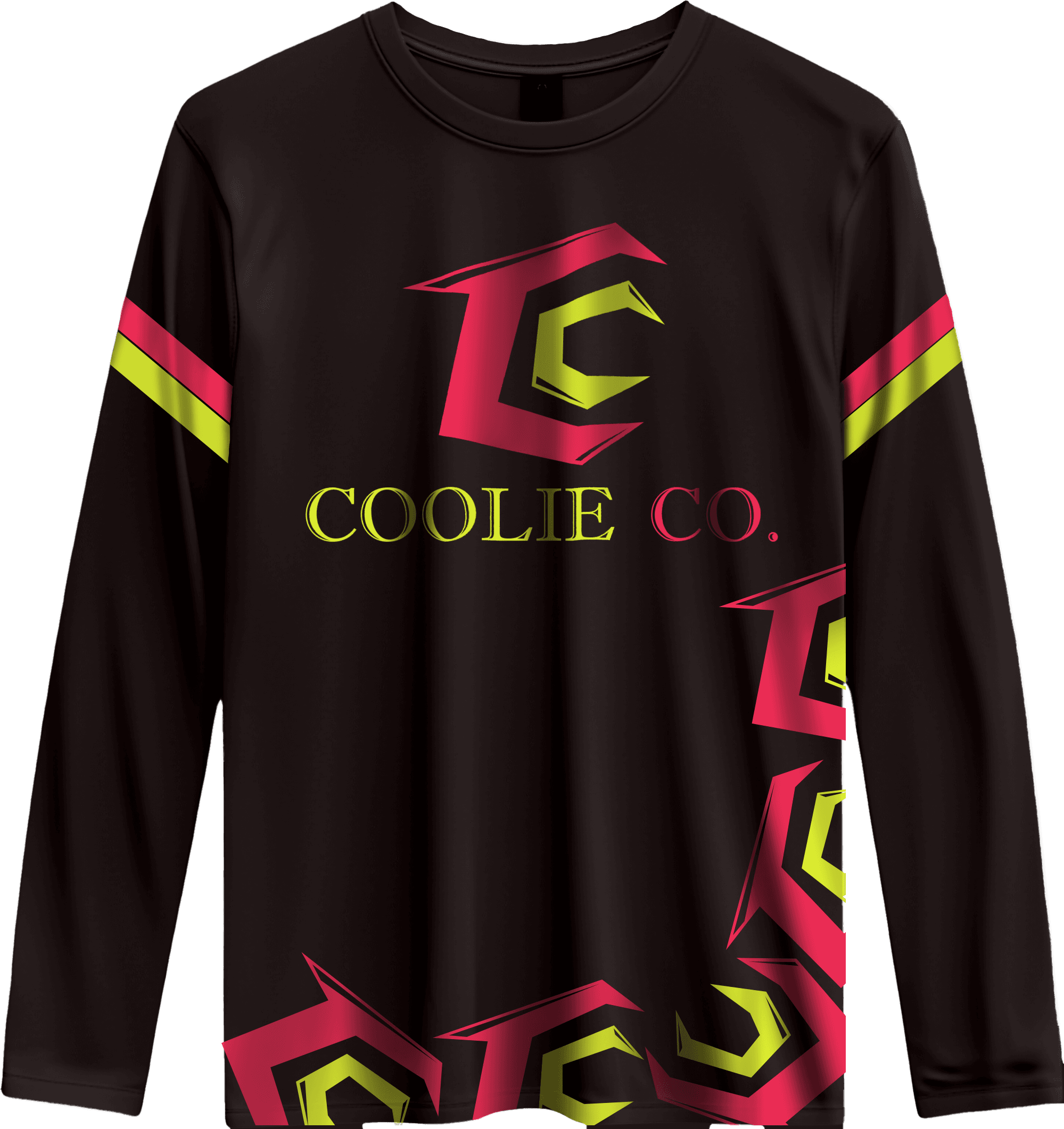
The challenge was to create a motocross apparel identity that felt authentic to the culture of the sport without relying on overly familiar or generic visual conventions. Coolie Co. needed a distinctive personality that could appeal to riders while remaining recognizable across a growing collection of apparel and branded applications.
The identity also needed enough flexibility to support different graphic treatments without losing brand recognition. Individual pieces could vary in composition, scale, and application, but they still needed to feel unmistakably connected to the same Coolie Co. visual system.
This required developing a strong core identity that could remain recognizable even as the surrounding graphics and individual applications changed. The final system needed to balance consistency with creative flexibility, giving the brand room to evolve across different products and applications while maintaining the bold attitude, energy, and distinctive visual personality established at its foundation.
The visual direction was built around creating a bold identity that feels connected to motocross culture while remaining versatile enough to extend beyond apparel. The custom logo and supporting graphics draw inspiration from the mechanical details, movement, and rugged character of the sport, establishing a strong foundation for the wider Coolie Co. brand.
Consistency was maintained through typography, colour, graphic treatments, and repeated brand elements, allowing the identity to adapt across very different applications. This flexible system creates a clear connection between the apparel collection and professional stationery, ensuring both sides of the brand feel intentional, recognizable, and part of the same visual identity.


The dieline provided the foundation for the entire packaging system, establishing the dimensions, folds, panels, and structural relationships that the finished design needed to accommodate. Designing within this framework required considering how each element would function independently on the flat layout while also contributing to the complete experience of the fully assembled package.
Particular attention was given to how graphics and information interacted with folds, edges, and adjoining panels throughout the design. Placement had to account for orientation, alignment, and physical construction while maintaining a natural visual flow around the box. This ensured that every panel remained connected to the larger visual system and that the finished package felt cohesive and intentional from every viewing angle.
The Coolie Co. identity was extended into a coordinated stationery system that translates the energy of the brand into more professional communication materials. Business cards, letterhead, and supporting pieces use the established typography, colour, and graphic language to maintain a strong visual connection to the core identity.
The stationery demonstrates how the brand can shift into a more structured and functional setting without losing its distinctive personality. Consistent placement, hierarchy, and supporting graphic elements create a unified system that feels professional while remaining unmistakably connected to the motocross-inspired character of Coolie Co.

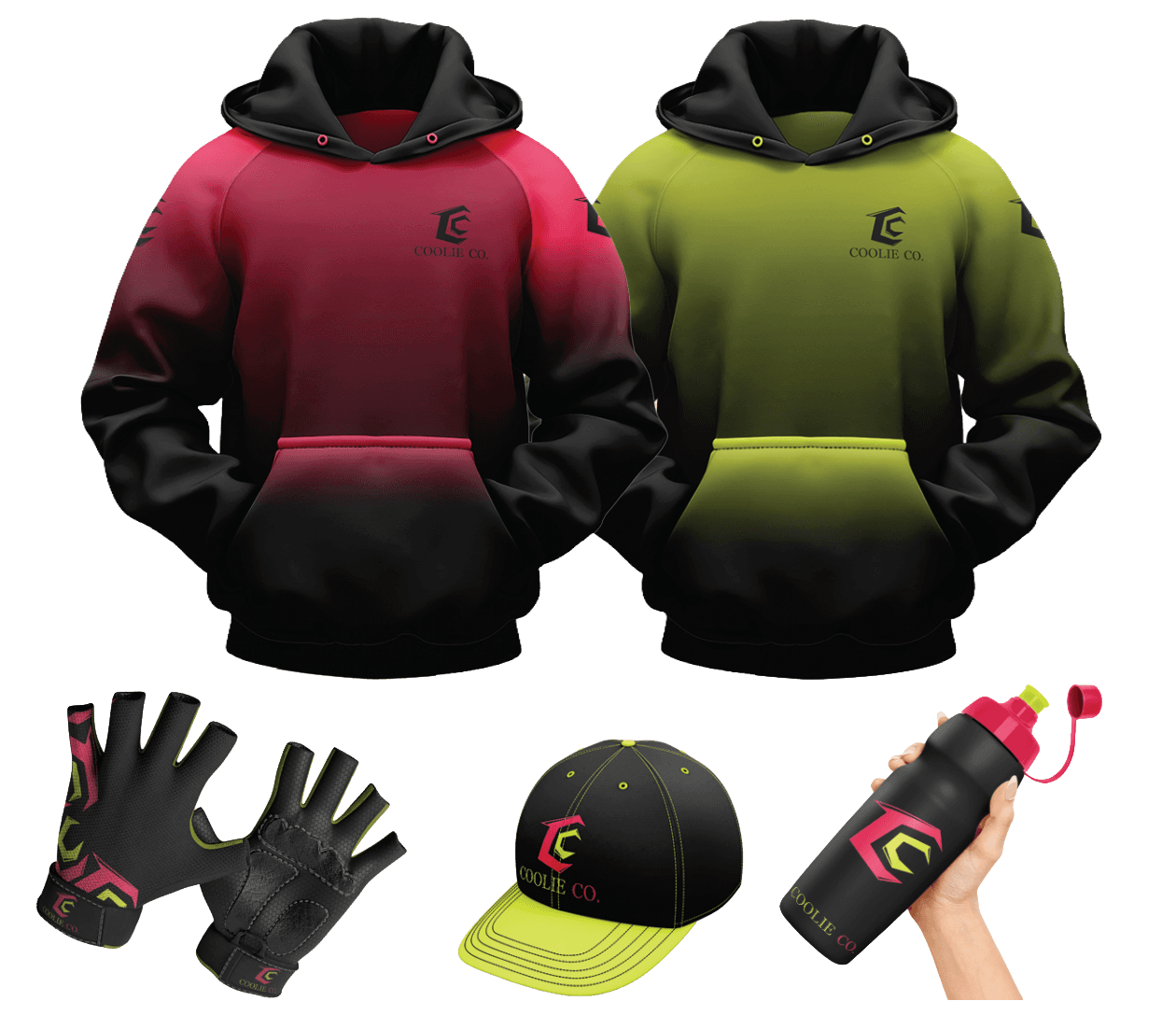
The Coolie Co. identity expands into a merchandise collection designed to bring the brand directly into motocross culture and everyday life. The established visual system provides a consistent foundation while allowing individual pieces to explore different compositions, graphic scales, and treatments without losing their connection to the overall identity.
Apparel pieces use variation to create a broader and more versatile collection, while applications such as the branded water bottle demonstrate how the identity can extend naturally beyond clothing and into everyday use. Together, the merchandise creates multiple expressions of the Coolie Co. personality while maintaining recognizable typography, graphics, and consistent brand elements throughout the entire merchandise collection.
The completed Coolie Co. identity brings together a distinctive visual system, professional stationery, and branded merchandise within one cohesive motocross-inspired brand. From functional business materials to expressive apparel applications, each piece maintains a clear connection to the core identity while adapting naturally to its individual purpose.
The resulting system gives Coolie Co. the flexibility to grow across new products and applications without losing its recognizable character. The brand remains bold, energetic, and rooted in motocross culture while demonstrating the versatility needed to function consistently across both professional and consumer-facing environments.
